24

All the scribbly-doodles and the cartoonish font on Programmers seems to me like a reason people might assume from the start that this site is for more chatty non-professional questions.

Would it be worthwhile to try and get the site redesigned? Do you think this would cut down on low-quality questions, attract more professional questions or generally benefit the community now?

Historically I understand the layout was done for the site when it's main goal was different than that which it is now, and I think there is now a discrepancy between the site's purpose and appearance.

Would this however be detrimental? Is there precedence of any other SE sites that are up and going full-steam getting a makeover, which we could identify results of the endeavour from, both pro and con?

15
  • 7
    Must resist urge to tag this [status-bydesign] ;P
    – yannis Mod
    Commented Nov 13, 2012 at 23:00
  • 3
    "Is there precedence of any other SE sites that are up and going full-steam getting a makeover" - Yes, Arqade went through a pretty dramatic makeover fairly recently
    – Rachel
    Commented Nov 14, 2012 at 2:25
  • @Rachel Yes, but Arqade is a bit special. Programmers, not so much. It's precedent all right, but we shouldn't get our hopes up.
    – yannis Mod
    Commented Nov 14, 2012 at 2:35
  • @YannisRizos I'm special :( Arqade's reason was branding which is interesting.. Will have to poke around and see if they saw any detriment caused by their change, though I imagine Arqade to be a pretty free-wheeling place to begin with and unlikely to have its pot stirred by much. Commented Nov 14, 2012 at 2:41
  • @JimmyHoffa Arqade exploded traffic wise, and we'll probably never get as much traffic as they do (that's not necessarily a bad thing).
    – yannis Mod
    Commented Nov 14, 2012 at 2:52
  • 3
    +1 only because I like experiments
    – gnat
    Commented Nov 14, 2012 at 9:22
  • 3
    @gnat that's kind of my thoughts too, I'm an engineer; I like to take different approaches to gather empirical data. Commented Nov 14, 2012 at 15:28
  • Well, there is one way to experiment to see if your theory is valid or not. Have SE apply the beta theme to the site. We should then be able to get statistics to see if the design affects question quality, without an investment in Jin's time.
    – Walter
    Commented Nov 14, 2012 at 16:11
  • @Walter Great idea! I was hoping if the P.SE community liked the idea we could try and enlist either a member from this community or UX.SE/graphic design.se/somewhere as a volunteer knowing they'd get the benefits of their design prominently displayed in the SE network as a means to not use Jin's time, but the beta idea is a great way of gathering evidence before even bothering anybody's time Commented Nov 14, 2012 at 16:16
  • Personally I don't think the design will have an affect on question quality but until there is actual data to support/refute the notion, it's all just hot air.
    – Walter
    Commented Nov 14, 2012 at 16:38
  • 3
    I love the current theme, especially the erased whiteboard background. I think it's brilliant. But I don't know what the alternative is. You could try something and save the old theme. Trust me, we'll all tell you if we don't like it. Of course, that could be distracting. You could always post a screen shot of an alternative if you like making themes. Commented Nov 15, 2012 at 3:28
  • @GlenPeterson This isn't really about personal preferences.
    – yannis Mod
    Commented Nov 15, 2012 at 4:25
  • I never understood this choice of theme for Programmers.SE from day 1, and I still don't. In my several years of encounters with programming, I have never touched a whiteboard except for an interview which didn't go so well. I hated programming on a whiteboard. I think a new beautiful design showing what programming is really about, at its core - writing code - would be a better fit.
    – ADTC
    Commented Sep 10, 2014 at 4:14
  • 1
    @ADTC you are in the minority in this regard I think. Over my career I have relied on whiteboards constantly - and this reliance is something I see pervasive throughout my colleagues at the jobs I've worked. That said, I just think the scribbly appearance of the site gives a less-than-professional appearance while the site is explicitly for professional programmers. Commented Sep 10, 2014 at 17:56
  • This is a great idea! I wish it weren't declined.
    – 0fnt
    Commented Jun 10, 2015 at 1:44

6 Answers 6

20

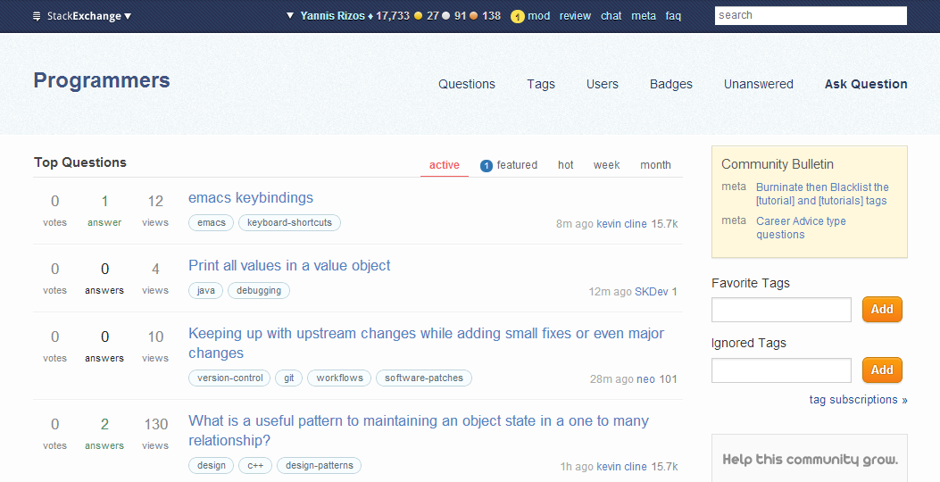
There are a lot of things I don't like about the site's design, to the point that I'm using a stripped down version of NullUserException's Theme Switcher userscript to browse the site with the Beta theme:
enter image description here

Although it's a very basic theme, I find it quite more enjoyable than the actual theme. But, who cares what I find enjoyable or not, this discussion is about identifying flaws in the design that are a bit more important than personal preference.

First, the whiteboard concept. As you probably already know, the core concept of our design is inspired from this paragraph of Introducing programmers.stackexchange.com:

In a nutshell, Stack Overflow is for when you’re front of your compiler or editor working through code issues. Programmers is for when you’re in front of a whiteboard working through higher level conceptual programming issues. Hence the (awesome) whiteboard inspired design!

It's a great concept, and I'd be lying if I pretended I have a better idea. That said and while a whiteboard is an easily identifiable element of the software design process, it's also supposed to be ephemeral and sloppy. And basing the entire design on handrawn elements comes out more as sloppy than casual and/or conceptual. I don't know if the playful nature of the design was intentional or not, and I might be completely wrong but I feel that the original, more relaxed scope of the site was taken into consideration, even though the design was finalized after the scope changed.

The first round of design ideas was a lot cleaner and simpler than the second round and I'm guessing that feedback from the community played an important role in what appears to be a very drastic change in direction. The community back then was more accustomed to the old scope, and if you read through both discussions you'll find out that differentiating the site from Stack Overflow was considered quite important.

And it was, but I don't think it is any more. Programmers being defined by what it's not, rather than what it is has been a constant PITA for the community, and I really don't see why it should be such a big part of our identity now. We've gone a long way, we've certainly proved that we can stand on our own, and I'd really love it if the site's design and overall branding reflected that.

I'm not suggesting completely dropping the whiteboard concept (at least not until I come up with a better idea; expect a long wait), just that we're overusing it. Almost every design element has a hand-drawn look and feel, using Hugh Laurie's handwritting as our main font is completely nonsensical (more on this later), and nothing in the site says "professional". Our design is far from clean and simple, in contrast with almost every other Stack Exchange site that targets professional audiences. Compare it, for example, with:

Even sites that mostly target enthusiasts, like Bicycles, have cleaner and less playful designs.

The Font (mini rant)

I never understood why Hugh Laurie's handwritting was relevant to a site about conceptual questions on software development. I can certainly appreciate the nerd value, but:

  • It's just a TV show.

    A great TV show, but just a TV show and one that has absolutely nothing to do with programming. We love fun as much as everyone else, but this is supposed to be a place where we hate fun.

  • It's handwritting

    Not really the optimal choice for several of our labels, for example: cohhunity bulletin. Any handwritting font has similar problems, and that's simply because handwritting fonts aren't really supposed to be clear and readable.

  • IT'S AN ALL CAPS FONT

    Why are we shouting things like "QUESTIONS", "COMMUNITY BULLETIN", "FAVOURITE TAGS"? Do we really need to emphasize labels that no other professional oriented Stack Exchange site seems to be emphasizing? Is there any value to using an ALL CAPS font, other than being annoyingly distracting? The only other site that uses ALL CAPS seems to be Arqade, which kinda proves my point, Arqade is awesome, but professional is not.

All we're gaining with the font is nerd value, and I'm afraid going for nerd value on a site that's striving to be the resource for conceptual software development questions isn't really a good idea, it's a quirky in joke that's fuelling a bad stereotype.

Can the design be changed?

A complete re-design is probably out of the question. Jin, Stack Exchange's designer, already has a huge backlog, even if we only consider the custom themes of the Beta sites that are graduating. However I always felt that Programmers didn't really have the benefit of the normal process, with the drastic change in scope, and I'm hoping we could at least persuade Stack Exchange to at least consider taking another look at our theme, and perhaps we could just tone done some of the more playful elements. A few ideas:

  • Getting rid of the font,
  • Toning down (or completely removing) the horizontal header and footer lines,
  • A less curvy and over-styled header and footer,
  • Moving on from the whole whiteboard-y / handwritten style for at least some design elements (vote arrows, for example).

And while we're at it, we could also fix the damn links ;P

I want to make it abudantly clear that changing anything in the design, even a complete re-design, would probably do nothing at all to prevent low quality questions coming in. If that's our reason for changing the design, there are quite a few other things that we should improve first that would be far more beneficial in communicating what the site's about and what our general expectations are (stop upvoting crap, for example).

I do feel though that a less casual, less playful design would help better communicating the site's purpose to our target audience. I had to explain the handwritting font a couple of times, and the response was less than enthusiastic, for more or less the reasons I explained in the mini-rant. My main reason for advocating for a cleaner, simpler, and all around more professional design is that it would help me advertise the site on professional communities, without having to explain quirky in-jokes or the no longer relevant need to differentiate ourselves from Stack Overflow.

8
  • I'm updating the answer, deleting while I'm working on the new version.
    – yannis Mod
    Commented Nov 14, 2012 at 9:25
  • +1: IMO - This is one of your best answers on the entire stackexchange network. I tried to get some attention on the 'Cohhunity Bulletin' question, but people didn't care! meta.programmers.stackexchange.com/q/3529/1996
    – Jim G.
    Commented Nov 14, 2012 at 18:11
  • 2
    Boring. I like the current theme much better. This just doesn't look like any fun. Commented Nov 15, 2012 at 3:29
  • I think the only relevance of the font was that the show's character writes a lot on a whiteboard, and we originally mainly focused on whiteboard-type questions. It's not like we're using Comic Sans MS.
    – haylem
    Commented Nov 20, 2012 at 17:21
  • @haylem I know what the relevance is, and the font looks like Comic Sans to me (honestly). That said, it's not a big thing and it certainly doesn't stop serious contributors from participating (you're here, I'm here, and so are quite a few other people). I just don't like explaining it to people, it's a quirky in-joke that doesn't really make much sense.
    – yannis Mod
    Commented Nov 23, 2012 at 14:56
  • @YannisRizos: I don't mind in-jokes too much, as I think our field and its culture (call it computer culture, hackerdom or whatever you feel an attachment to as an IT professional or programmer) is filled with wonderful anecdotes and insider jokes with not often much relevance but just historical fun.
    – haylem
    Commented Nov 23, 2012 at 21:51
  • @YannisRizos: But I see your point and I agree that when it came to the P.SE font, the first time I read the meta post mentioning it I thought "but... why?!", considering it doesn't really relate to our culture that much. However, a design with consolas or courier new or something would have pissed me off even more I think, being too geeky. I kinda like the whiteboard / sketchy / prototype-like look and feel though. The problem, in my opinion, is that, like the site's name, it doesn't really fit to the direction we try to give it. But that's already way too debated in other places.
    – haylem
    Commented Nov 23, 2012 at 21:52
  • Will there be a site redesign contest any time soon? Even the Arqade design is better, and it's retro-gaming style because it's all about gaming - an awesome fit. But programming = whiteboard with illegible ALL CAPS handwritten font? Gimme a break.
    – ADTC
    Commented Sep 10, 2014 at 5:39
12

Honestly, I like the theme. I find the hand-drawn, hand-written, squiggly-line vibe to be indicative of what this site is about--whiteboarding questions. You could migrate it to something more techy-looking, but that would only further blur the line in most peoples' minds between Programmers Stack Exchange and Stack Overflow.

Obviously, I can't say what I would think if someone were to pitch out a brand new design. I may very well like it better, but I do not at all think the current theme to be inappropriate to the site content.

2
  • 1
    I do agree I would be concerned with it growing more confused with StackOverflow, though I would imagine something more professional/industrial rather than techy, look at cstheory.se and while it has overlap with us and SO in some ways, it's appearance clearly makes you feel like it's purpose is academic, I agree SO's appearance makes you feel it's techie, but Programmers goal isn't techie; it's professional, and it would seem to me that is different enough from techie to be distinguishable... but again, I agree it is a risk. Commented Nov 14, 2012 at 15:34
  • 1
    As the content and aim seems to have more or less converged with Stack Overflow now compared with when it started out, a more stack-overflow type font might be appropriate. Perhaps combined with appropriating the Stack Overflow design elements too. And changing the name to "Stack Overflow." Where Programmers started out as a place to share experiences of development in a more open way, it is now restricted to very tight content and it is hard to see why the site couldn't be migrated into a bunch of tags on SO.
    – glenatron
    Commented Nov 26, 2012 at 12:27
9

There has been a precedent of a site receiving a redesign, but it had to do with branding rather than any dissatisfaction with the existing design. In fact, the new design on Arqade is mostly the same as it was on "Gaming" back in the day.

Far as redesigning Programmers goes... I'm sorry, but it's at best extremely unlikely. There are certainly issues here and there that could be fixed up, but a complete redesign isn't going to happen.

We have one designer (see if you can spot him!) and no shortage of design projects and things that require his attention. Just going purely by priorities, even if we agreed to redesign Programmers, it simply wouldn't happen in the foreseeable future.

We do our best to come up with a design that represents the community and reflects the scope of the site, but it's impossible to please everyone, so once the design is set... for better or for worse, it is what it is.

I've made this argument before and I'll make it again: other professional questions and expert answers are what attracts more professional questions, not the font style or the site logo. Granted, a site rendered in, say, Comic Sans wouldn't exactly inspire confidence, but we're not talking a garish Geocities-like eyesore here.

My advice is to identify specific issues with the design (like, say, ALL CAPS ALL THE TIME) and make feature requests/bug reports about those. I can't promise that all, or even most, of those will be fixed, but we'll do our best as we get the time. In the meantime, focus on the questions and the answers. That's where the true strength and purpose of the site is.

(Fun fact: we're hiring a product designer. If you know someone who would fit the bill, please send 'em our way before Jin rebels.)

2
  • 1
    While I appreciate that other professional questions attract more, this site doesn't have an issue attracting professional questions, it does however have an issue attracting too many non-professional questions which are promptly closed making it appear extremely unfriendly. But I can appreciate that as you said there is no resource or priority for programmers to get a redesign. Thanks for your input, and perhaps I'll see if we can at the least get the font changed if you think there might be room to get small changes like that. Commented Nov 15, 2012 at 17:10
  • @JimmyHoffa The font thing is a firm maybe. I can't speak for Jin there and I'm not sure how big of a deal it is for the overall design.
    – Adam Lear StaffMod
    Commented Nov 16, 2012 at 20:22
4

Sounds like something that could be A/B tested. We're programmers, after all, we could do this properly.

2
  • I like the idea, but how would you propose we do this? I'm guessing if we even get allowed to change the layout (unlikely) I can't imagine they'd let us switch back and forth a bunch of times.. though it could be worth suggesting to them. Did you have an ideas on how to implement such? Commented Nov 14, 2012 at 15:27
  • It'd need support from the company, @jimmyhoffa.
    – user4051
    Commented Nov 14, 2012 at 19:05
3

Risking the downvote here, as this is a random answer.....but considering what Programmers is all about, why not use elements of a puzzle? (The 2D cardboard ones, I mean.) I understand the whiteboard theme, but I agree that it doesn't work well. Puzzles share a lot of the same metaphor and are more easily understood by non-programmers (and people who weren't in on the original in-joke; I never knew the Hugh Laurie thing when I first came here - I just thought that the design was really slack).

As programmers, we solve puzzles every day. Perhaps that can be a central part of a new site design.

1
  • Actually, hey. There are beta themes? How does one go about making one of those? Depending on my time, I might be able to mock something up.
    – user26452
    Commented Nov 14, 2012 at 18:30
3

I definitely agree. In my opinion the sites doodley theme makes it hard to read and really take seriously. I'm not saying the site has to have a clinical html-theme, but a little more subtlety would not be a bad change. I think stackoverflow's theme looks really nice, and it would definitely be a good model.

To the graphic designer: I think the doodley theme is really well done, just not necessarily the right place.

You must log in to answer this question.

Not the answer you're looking for? Browse other questions tagged .