12

One of the big 7 questions.

  • One suggestion per answer please

Logo guidance, from Jin (resident UI designer for at least some of the Stack Exchange sites):

Please note: I prefer gray-scaled logo submissions, that way we can judge the IDEA of the logo more objectively. We can always add colors to the logo later. Also, the logo itself(sans the site title text) should be able to fit in a square dimension nicely. This way we can use it for favicons, mobile touch icons etc.

6
  • 2
    Perhaps we should wait on this until we can come up with a domain. Commented Sep 3, 2010 at 20:44
  • 2
    Also- community wiki! Commented Sep 3, 2010 at 20:50
  • @Nathan - This came up on one of the other sites. While the name will have an influence on the logo, the design should be independent.
    – ChrisF Mod
    Commented Sep 15, 2010 at 22:12
  • @Nathan It shouldn't, most people are going to be putting their time into it and should get credit
    – TheLQ
    Commented Sep 15, 2010 at 23:11
  • 2
    @TheLQ: credit is not an issue on Meta, as you don't get or lose rep. Also, Community Wiki is not for preventing rep gains. Community wiki would be useful here as it would allow logos to be collaboratively iterated.
    – user8
    Commented Sep 16, 2010 at 22:41
  • I think we should let Jin come up with a few sketches.
    – Mark C
    Commented Nov 30, 2010 at 1:32

4 Answers 4

12

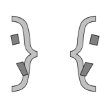
Supposing the current best suggested name might have a good chance to become our domain:

alt text

And an example of a tiny version which still needs some improvement through some pixel pushing:

alt text

About the colors:

We need to find a color that has a good characteristic for our site, maybe one that expresses subjectivity... I think we should change the color of Scope. We can also place a vertical line with the color in the tiny version which denotes the typing cursor, as if one is willing to type something between the brackets.

6
  • 3
    /* Maybe with comment markers instead of curly brackets */
    – DavRob60
    Commented Sep 20, 2010 at 18:02
  • I don't think that would work well with the scope concept, and it is a problem for smaller versions... Commented Sep 20, 2010 at 18:08
  • 1
    Not sure about the exact implementation, but I love the idea. Just like SO's logo, it simply and succinctly illustrates the name. :) Commented Sep 21, 2010 at 17:46
  • 1
    +1 But I would like to drop the second bracket and just have: } Out of Scope
    – Jonas
    Commented Sep 22, 2010 at 20:13
  • 1
    No, although the Super User logo had an influence on this idea, I think it is best to stay away from that by having two brackets. A single bracket in a small/tiny version will look too much like Super User... This logo is trying to stay apart from the Super User version. The only thing you might still think about is that those brackets are two discussing programmers, but I think it's best not to add an eye or mouth to keep the brackets related to programming. Commented Sep 22, 2010 at 20:49
  • @TomW Let us continue that thought and say, let us not use brackets at all!
    – Mark C
    Commented Nov 30, 2010 at 1:32
12

Here's a quick logo concept:

Think outside the brackets

I can work on an improved version (trying different fonts, positioning, etc), and do variants with motto/etc if people like the idea.

7
  • I was trying to think if I could represent 'wisdom' ( see comment by Kate ), but without implying 'discussion' nor making things too busy - let me know if anyone has thoughts on that? Commented Oct 23, 2010 at 17:21
  • Oh, and this was inspired by the "think outside the brackets" motto suggestion - just noticed the similarity with TomWij's smaller version. Heh. Commented Oct 23, 2010 at 17:36
  • It's a very good start to me.
    – Maniero Mod
    Commented Oct 23, 2010 at 19:51
  • The semicolons make them look like faces. Cool Commented Oct 25, 2010 at 1:59
  • I know I'm in the extreme minority here, but { :( } ( :) )
    – Inaimathi
    Commented Oct 26, 2010 at 0:08
  • 1
    +1 Now that is clever.
    – Kramii
    Commented Oct 26, 2010 at 10:59
  • 1
    Don't like the faces, I'd go with just the braces, personally.
    – Benjol
    Commented Dec 9, 2010 at 9:35
5

The first thing that comes to mind for me is a logo involving a cup of coffee and maybe some faded code in the background. Kind of like this, but less crappy:

alt text

I don't know, it is perhaps a little too reminiscent of the Java logo.

8
  • I like it! Perhaps get rid of the coffee cup though (because of the Java association), and have a programmer typing or something in its place? Commented Sep 15, 2010 at 18:35
  • @Chinmay The main reason for the coffee cup was to convey conversation- i.e. over a cup of coffee. If someone can think of a better alternative I'm all ears. Commented Sep 15, 2010 at 18:50
  • What about the wine image on cuisinecapers.com/wine-the-subjective-response or some drawing deduced from it? Or some kind of meeting picture that clearly shows that there are programmers involved? (A less wide version of sha3teely.com/wp-content/uploads/2006/08/meeting.jpg) Commented Sep 15, 2010 at 19:22
  • @Nathan: I understand that, but as you yourself said, it's a bit too much like the Java logo. I can't think of a better alternative right now, but I'll give it some thought... Commented Sep 15, 2010 at 19:50
  • I like the faded code, but Chinmay is right... the coffee cup will carry too much Java connotation.
    – MIA
    Commented Sep 16, 2010 at 2:56
  • @Jim Leonardo Yeah, I completely agree. Commented Sep 16, 2010 at 3:15
  • There are a few problems with this submission: 1) it's a [word mark](en.wikipedia.org/wiki/Wordmark_(graphic_identity%29) that doesn't work as a square icon, 2) it doesn't work as a two-color (i.e. black-and-white) logo, and 3) the source code behind the word mark indicates we deal with coding problems, when we don't. Note Jin's guidance on logos from Gaming.SE.
    – user8
    Commented Sep 16, 2010 at 22:54
  • Hey, you stole the layout concept from ticalc.org ! :)
    – Nicole
    Commented Sep 16, 2010 at 23:01
3

As long as it's not a copy-write issue.

alt text

The Concept of the logo is a combination of the stackoverflow logo and the meta.stackoverflow logo, hense the grey and colored rainbow.

I feel that the programmers site is a kinda of joining between both old sites so they meet together.

This was the orignal image from a meta image competion a while back.

All the talk of rainbows are making the logo a bit silly.

alt text

11
  • 3
    I like this. I dare say we could even just keep the right (gray) half. It would "complete" the SO logo per-se, and even still communicate the off-topic nature of this site. Heart pendants. Hah Commented Sep 16, 2010 at 16:26
  • You should mark this answer as community wiki, by the way. Commented Sep 16, 2010 at 16:27
  • I thought if the question was community wiki so were the answers, apologies.
    – Gordon
    Commented Sep 16, 2010 at 20:10
  • It would need some color, grey is boring. And I wonder if we should show the relation with SO. Commented Sep 16, 2010 at 20:50
  • @Gordon You're right, the answers are marked community wiki if the question is; unfortunately, the question isn't marked correctly. Commented Sep 16, 2010 at 23:45
  • how about a different color for every brick? Like a rainbow. Commented Sep 17, 2010 at 8:48
  • What about a double rainbow? But serious, I don't think rainbows fit our site. :-( Commented Sep 17, 2010 at 10:25
  • This could totally be our theme song youtube.com/watch?v=MX0D4oZwCsA Commented Sep 17, 2010 at 13:19
  • I see this logo like a dumping SO on P.SE.
    – Maniero
    Commented Sep 17, 2010 at 14:38
  • Could someone explain me that thing with rainbows and unicorns?
    – user2567
    Commented Oct 23, 2010 at 18:05
  • 2
    Looks like the evil child of SO & meta. Oh, wait...
    – Benjol
    Commented Dec 9, 2010 at 9:34

You must log in to answer this question.

Not the answer you're looking for? Browse other questions tagged .